BLUEFIN SWIMMERS
BRANDING • WEB DESIGN | 2014
OVERVIEW
BlueFin Swimmers is a Singapore swim school founded on a simple aspiration: to help children develop the energy, agility and confidence to move freely in water. The brand also carries a wider purpose – to nurture an awareness of the oceans and the plight of the bluefin tuna, and to inspire a younger generation to care for what lies beneath the surface.
The challenge was to create an identity that could bring these two ideas together: the vitality and joy of swimming, and a genuine concern for the marine environment. The result is a visual language that is energetic, distinctive and built around a story that children can connect with.
IDEATION
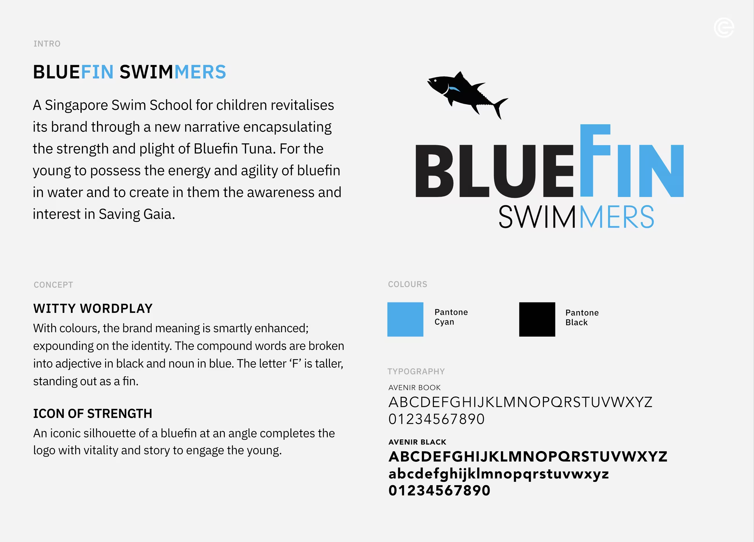
Witty wordplay: The name itself became the starting point for the identity. BLUEFIN is split into two visual elements, with BLUE in black and FIN in cyan, turning the compound word into a simple piece of visual storytelling. The enlarged F subtly takes on the character of a fin, giving the typography an unexpected sense of movement.
Icon of strength: A bluefin tuna in silhouette completes the identity. Recognised for its power, speed and agility in the water, the fish becomes an apt symbol for the qualities BlueFin Swimmers hopes to develop in young swimmers. At the same time, it carries a second meaning – a reminder of the species' vulnerability and the importance of protecting our oceans.
The result is a distinctive identity that combines playful wordplay with a strong graphic symbol, giving BlueFin Swimmers a visual language that engages the young while carrying a meaningful story about swimming, strength and the oceans.