THE DESIGN INCUBATOR
CREATIVE EDUCATION • BRAND IDENTITY • WEB DESIGN | 2012
OVERVIEW
The Design Incubator was conceived as a creative platform where budding designers and industry practitioners could meet, exchange ideas, experiment and learn from one another. More than a formal school or studio, it was imagined as an open space for curiosity – where self-initiated projects, mentorship and collaboration could become part of the learning process.
The challenge was to create a visual identity that felt less like an institution and more like an invitation to participate. The brand needed to appeal to young designers while remaining credible to experienced practitioners, creating a visual language that could accommodate a growing collection of ideas, personalities and creative experiments.
IDEATION
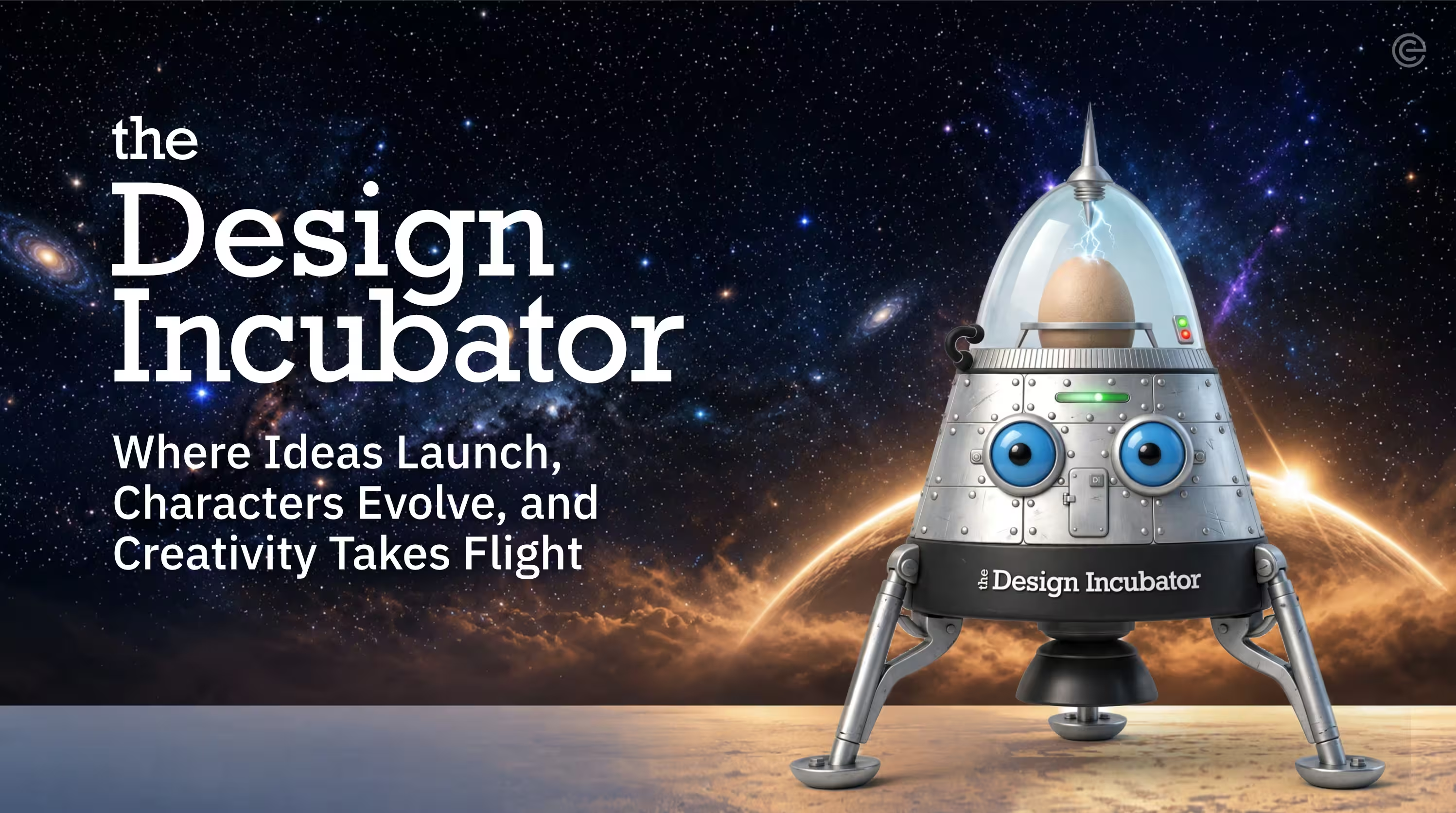
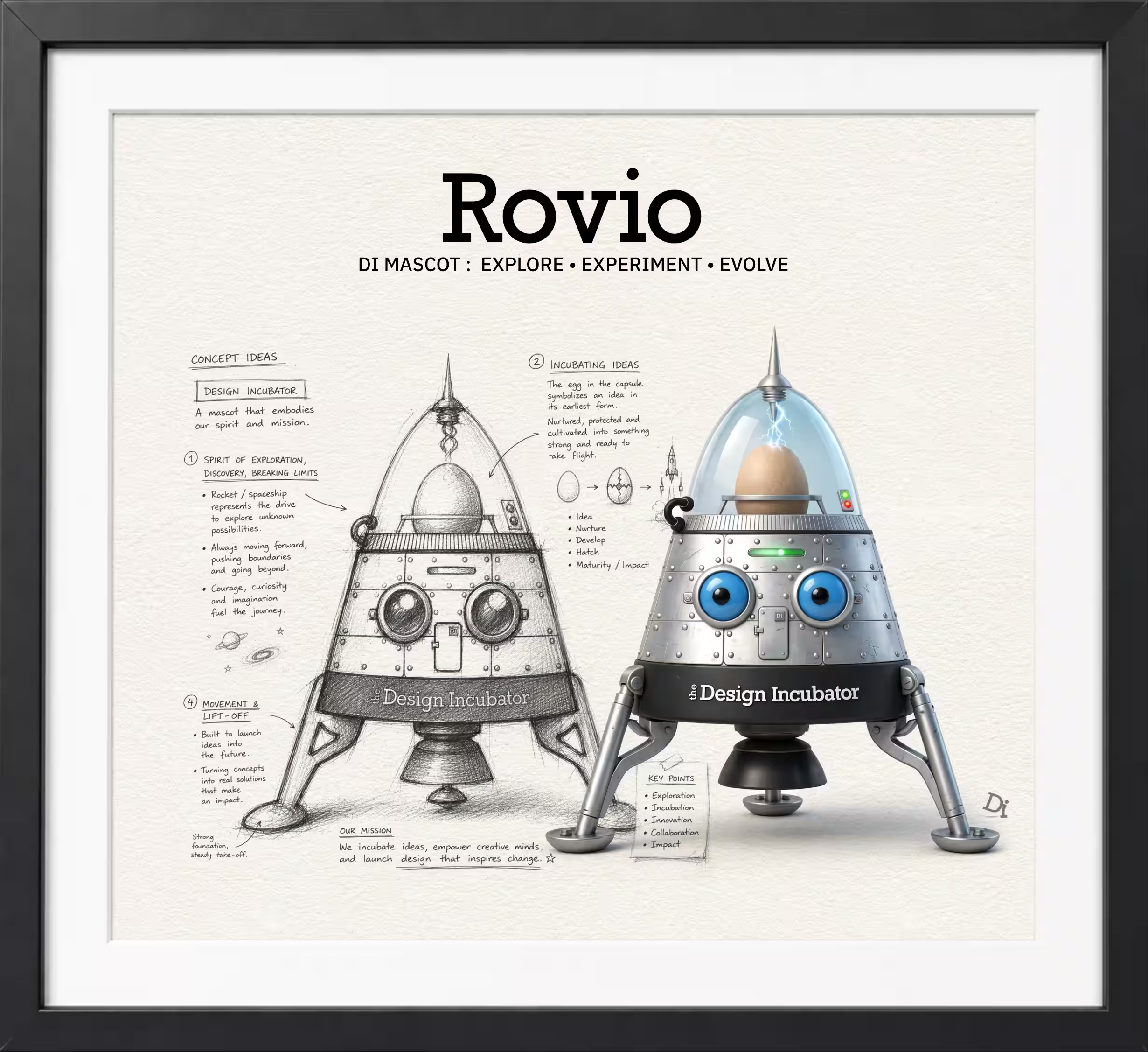
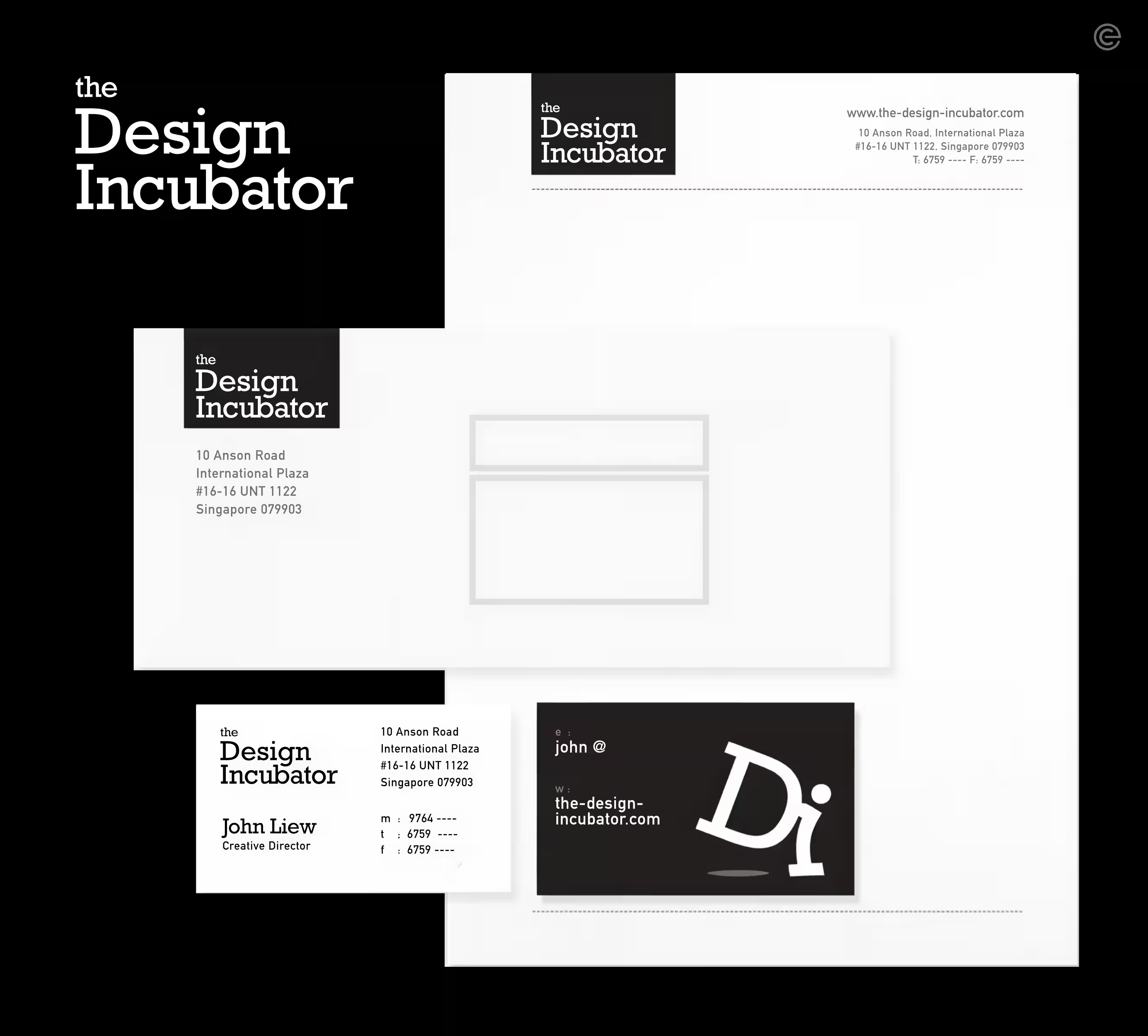
The name itself provided the starting point. An incubator suggests a place where ideas are nurtured, tested and allowed to develop – sometimes taking shape, sometimes changing direction. The identity embraces this sense of movement with a simple, contemporary logotype and a playful graphic language designed to accommodate experimentation.
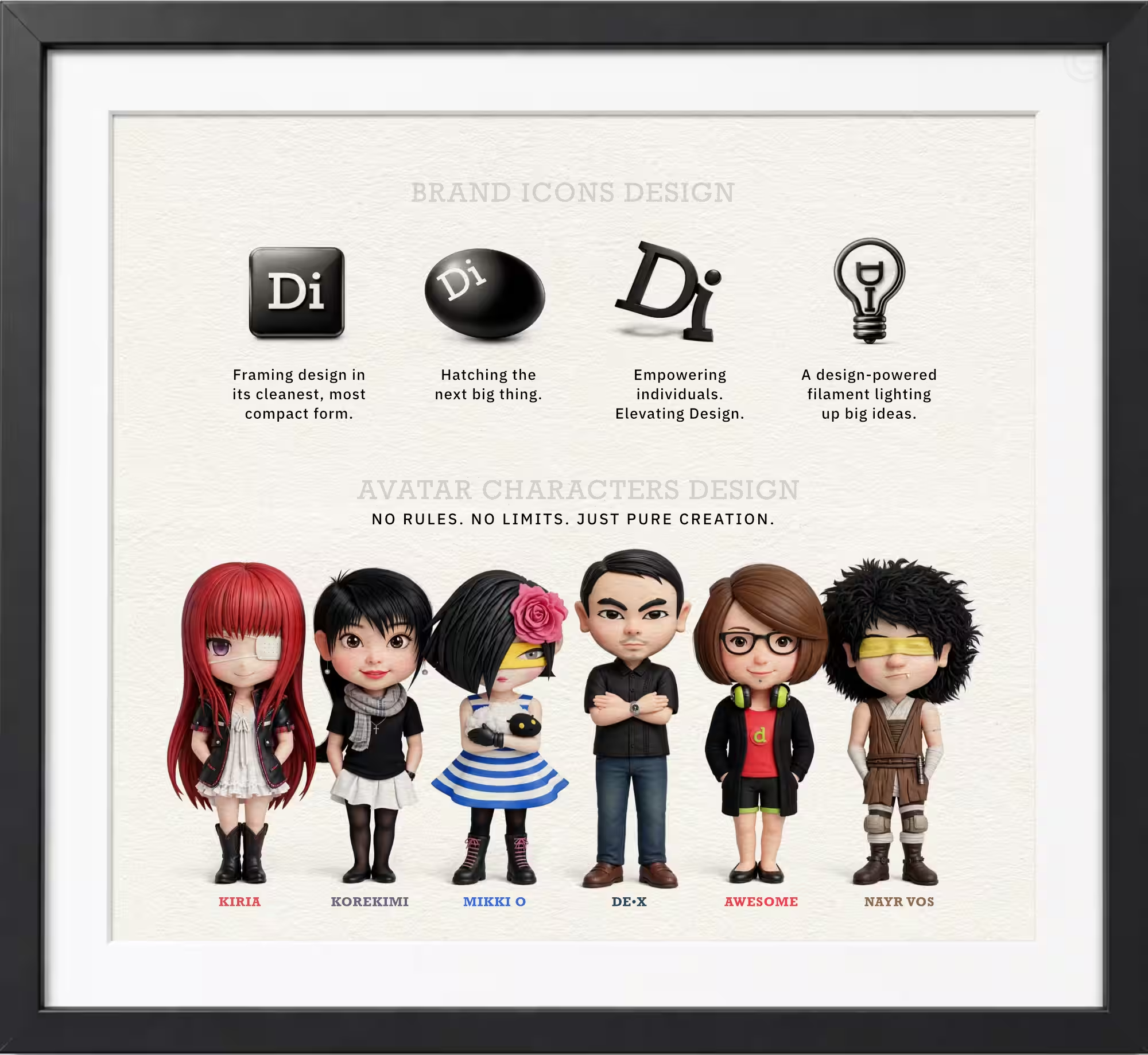
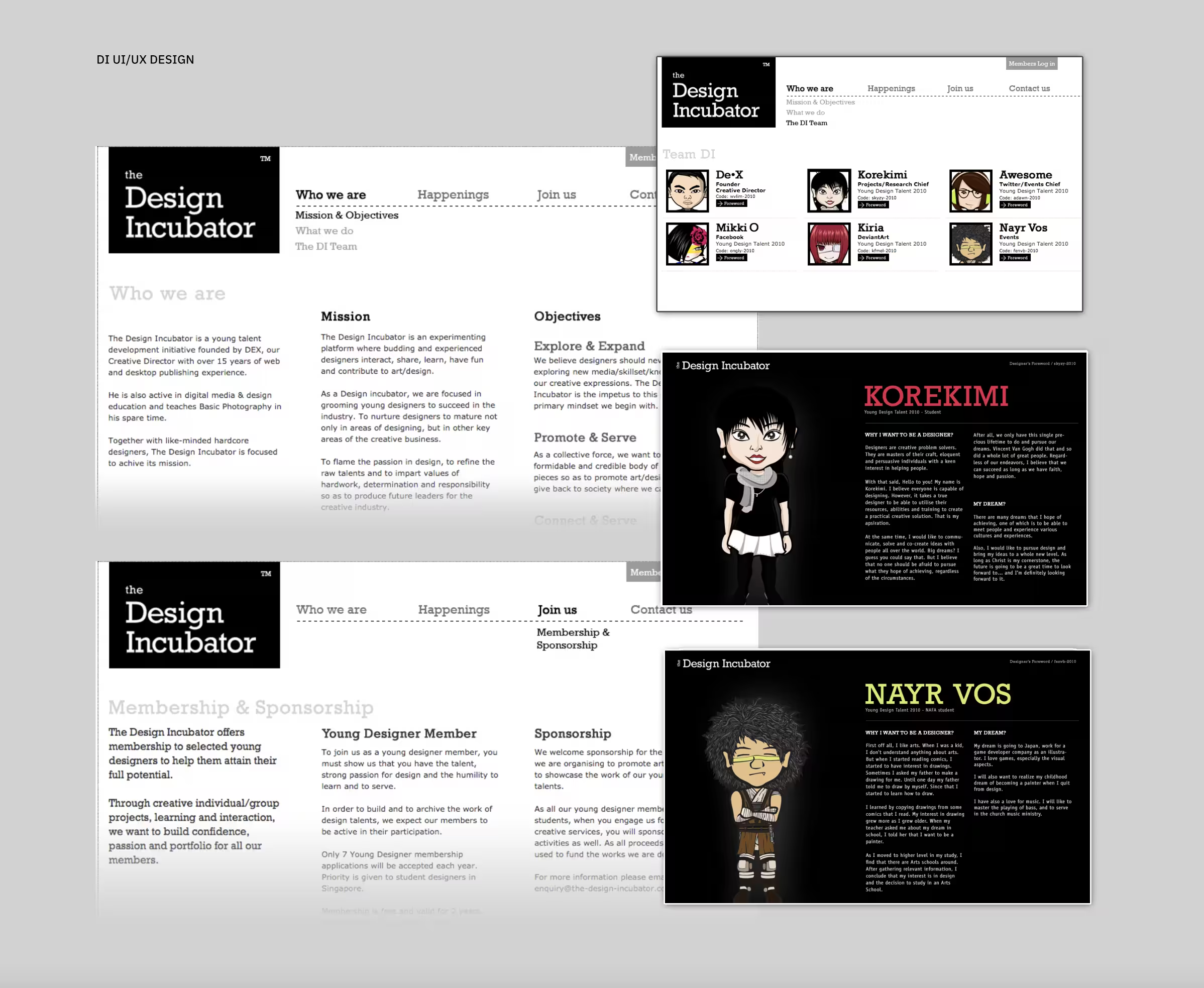
This thinking extended across the brand system, from illustrated avatars and character designs to icons, web graphics, stationery and corporate name cards. Rather than imposing a rigid visual style, the identity was designed to give different forms of creative expression room to coexist.
The result is a lively visual playground for learning and discovery – a brand identity that treated design not simply as a finished product, but as something to be explored, shared and enjoyed along the way.