DIAMOND BULK CARRIERS
VISUAL IDENTITY DESIGN | 2012
OVERVIEW
Diamond Bulk Carriers was a Singapore-based subsidiary of Mitsubishi Corporation, operating in the dry bulk shipping sector and providing maritime transportation for bulk commodities.
The challenge was to establish a distinctive corporate identity while retaining a clear connection to the heritage and visual equity of its parent company. The identity needed to project the reliability and authority associated with Mitsubishi Corporation, while expressing the strength and dynamism of the maritime business.
IDEATION
The identity is built around two ideas drawn from the company's heritage and industry.
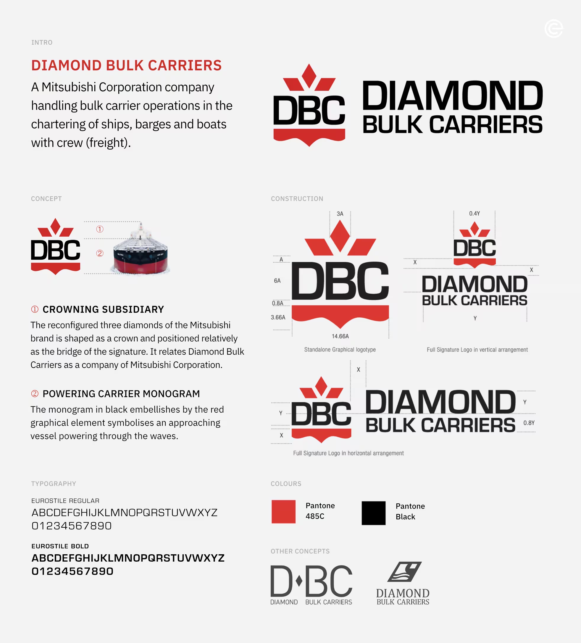
The three Mitsubishi diamonds are reconfigured into a crown, creating a distinctive subsidiary mark while retaining an immediate visual connection to Mitsubishi Corporation. Positioned above the DBC monogram, the crown acts as a visual bridge between parent and subsidiary.
Beneath the monogram, a red wave-like form suggests a bulk carrier powering through the sea. Together with the bold black lettering, the elements give the identity a sense of movement, strength and forward momentum.
The result is a corporate mark that carries the authority of Mitsubishi heritage while giving Diamond Bulk Carriers a character of its own.