CHAN MAN LEE TRADING
BRAND IDENTITY • WEB DESIGN | 2014
OVERVIEW
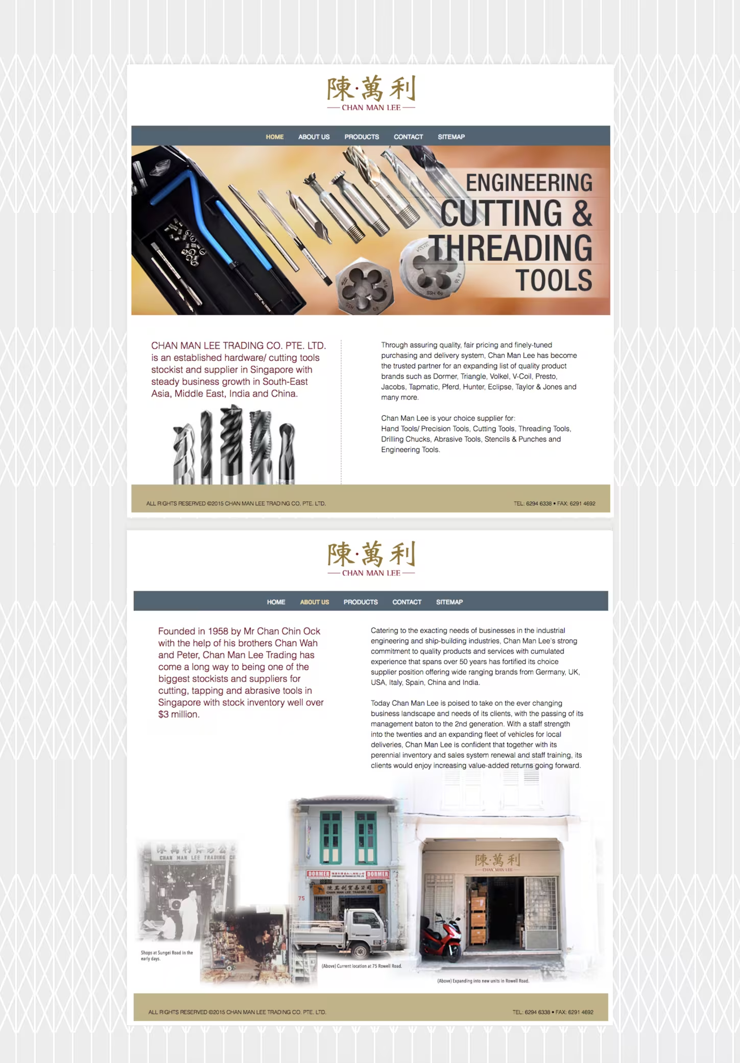
Established in 1958, Chan Man Lee Trading is one of Singapore’s established general hardware stockists and suppliers, specialising in cutting, tapping and abrasive tools. As the business moves into its next generation, a refreshed identity was needed to carry the brand forward.
The challenge was to modernise a long-established identity without losing the recognition and heritage embedded in its Chinese name.
IDEATION
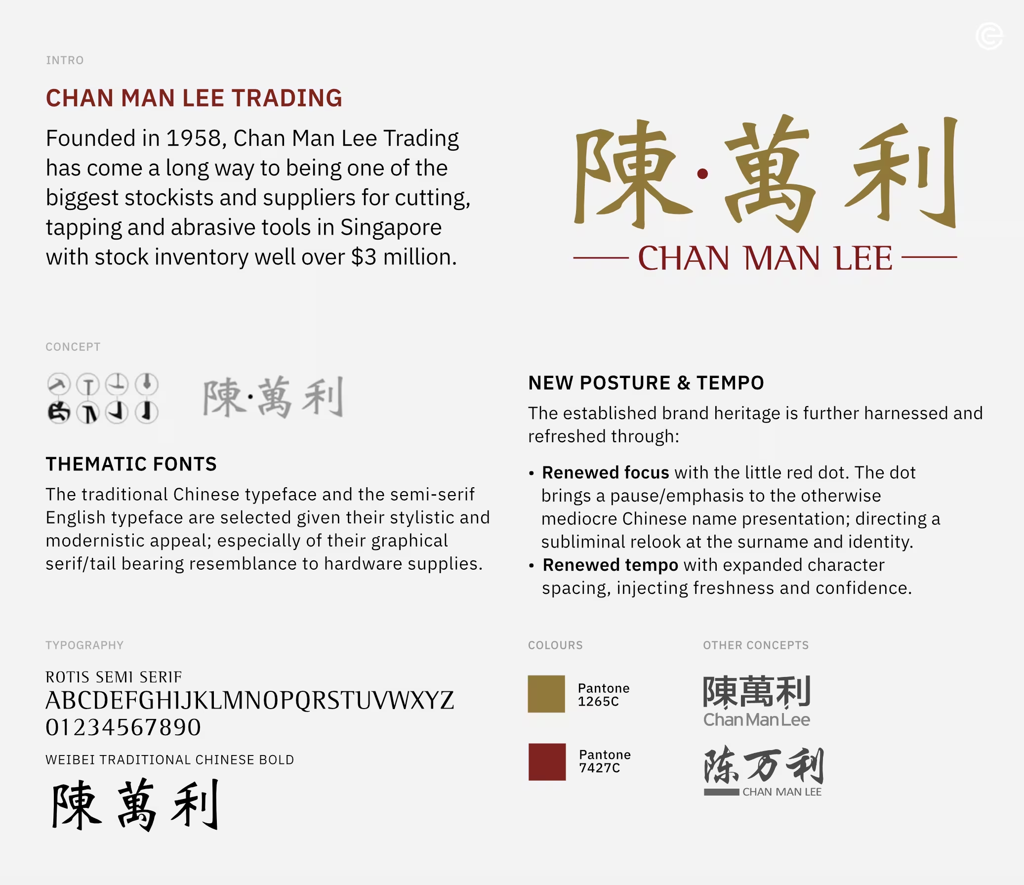
The identity builds on the distinctive Chinese name, 陈·万利, giving it a renewed posture and tempo through a considered treatment of typography, colour and spacing. The traditional Chinese typeface is paired with a semi-serif English typeface, whose graphic serif and tail details subtly echo the forms of hardware tools.
The small red dot introduces a deliberate pause within the Chinese name, bringing renewed focus to the surname while creating a distinctive visual point of emphasis. Expanded character spacing gives the mark greater openness and confidence, while the restrained red and gold palette retains a sense of established heritage.
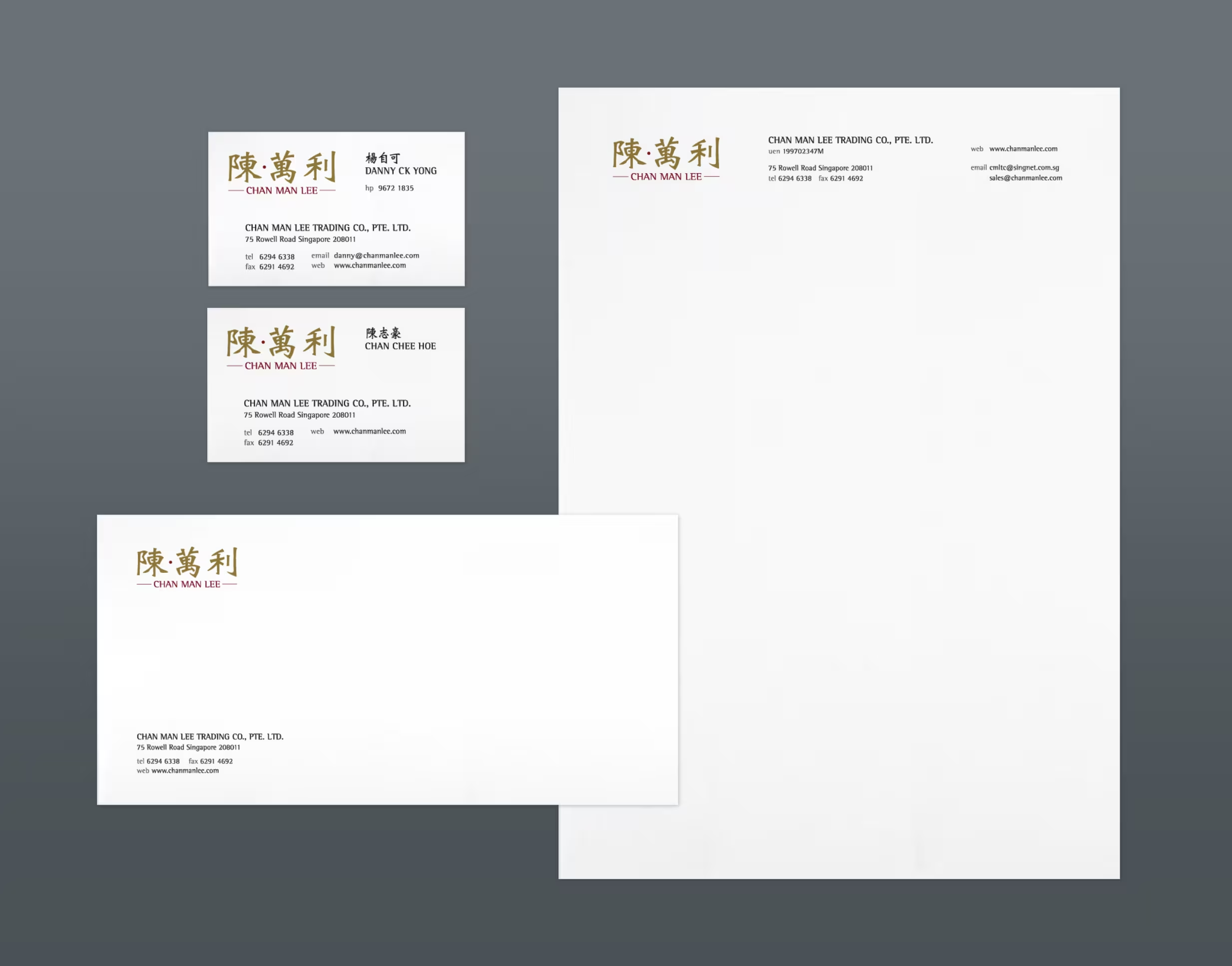
The result is a refreshed identity that respects Chan Man Lee’s long-standing presence while giving the business a more contemporary and confident expression.